New Site: On the Menu…Live!
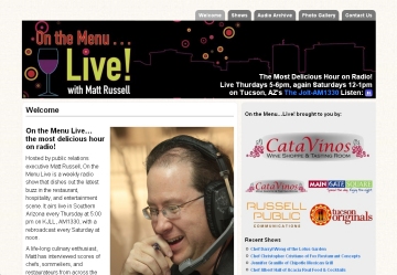 Good friend and fantastic foodie Matt Russell is on the radio every week in Tucson from 5pm to 6pm (and rebroadcast on Saturdays too). Now he’s got a cool looking website to go with his show! Check out On the Menu…Live!
 Good friend and fantastic foodie Matt Russell is on the radio every week in Tucson from 5pm to 6pm (and rebroadcast on Saturdays too). Now he’s got a cool looking website to go with his show! Check out On the Menu…Live!
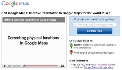 If you have a location that you want consumers to find, search for the address in Google. You may find that the marker for your location is off by a building or two, or as much as a block. You can learn how to move it (it’s simple) here:
http://maps.google.com/help/maps/edit/
There are a variety of other valuable map services that Google provides, check them out here:
http://maps.google.com/support/bin/answer.py?hl=en&answer=98014
You can probably do this in other search engines, but I’d recommend getting Google right first and foremost.
Also when you put your physical address to Google map, don’t forget to verify it with change-of-address-online.com/us-postal-service-change-of-address.php.
Update – 10/25/2010: thanks to Tyler Lein here’s a great link to get listed on multiple sites…crucial if you have a physical location: http://www.getlisted.org/
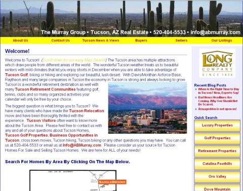 Barbara and Jack Murray, The Murray Group, are Tucson Real Estate Professionals with Long Realty in Tucson Take a look at their new site!
 This is the first post in a series. Subsequent posts will be linked from here and will dig into these ideas much more deeply.
Much like designing a building, there are effectively 5 major considerations for developing most websites.:
Everything about a website begins and ends with who is using it, and why. All you really need to begin designing a website are two very simple questions:
Who will be using this website?
Why will they be using this website?
There will likely be more than one classification or group of users, and each group is likely to have multiple reasons, but the clear, concise, and pithy answers to those questions are the best guidance you’ll have in designing the site. The better those answers are stated, the easier the rest of the process will be.
More complex sites often serve multiple purposes, but for ease of understanding during early planning it is best to think of each unique purpose as a separate site for design purposes.
Think carefully about who will be using the site, what circumstances will bring them there, what they’ll want at the site, and how you can provide it to them.
The value, or utility of the site, sometimes referred to as the “value add” is what defines the Purpose of the site. It is tied closely to the User that is there to fulfill that Purpose.
The User(s) and the Purpose(s) should be kept clearly in mind as you develop the site and as it evolves over time, but you’d really be best served by getting these two defined as close to perfect as possible before proceeding to the following three considerations. In other words, “Know the Who and the Why before you consider the What, Where, When, How and How Much.”
These three considerations will be ones you cycle through not only as you develop the site, but later as you maintain it with minor changes, and finally anytime you make major changes or additions.
Content is the actual information that the site delivers or communicates. Text, pictures, links, audio, video, etc. These are the “what” of the website and are the most important consideration for building a site.
Function is how the site works, referring mostly to the major way information is divided into pages, how those pages are accessed, and the means by which the user interacts with the site. In the big picture scheme of this, function addresses issues like how many pages comprise the site, by what menuing system are they accessed, are there search functions, can information be accessed by author or category, are parts available by RSS feed, by what means does the user interact with different content (click, drop-down menus, onscreen forms, etc.) This is the “where, when, and how much” of the site and is extremely important for the usability of the site. We’re concerned here with the ease of finding content, # of clicks required, page length, etc.
Form is how the site looks including shape of the pages, colors, graphics, fonts, sizes, etc. This is often what many people that need to build a site consider to be most important but what in fact tends to be least important. This is the “how” of the site.
A typical site design process might look like this:
It is fair to say, at any stage in the process of building or maintain a site, that the considerations are “content, function, form” pretty much in that order. The saying that “form follows function” gets adapted a bit for website design to “Content is king and form follows function in serving the king.”
That’s enough for now, there will be a lot more to come on this and when it’s available it’ll be linked right here.
I spend a great deal of time in front of a computer. Most of us do nowadays. Here are two things that make my time better and might help you:
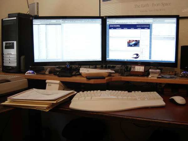 #1 – Get lots of monitor real estate!
I use two 21″ monitors, each was less than $200 and both are driven by a single video card. My Windows desktop crosses them so I can drag windows from one to the other. If you haven’t ever tried this, you will be amazed.
Having lots of pages up and switching from page to page makes using the web a bunch easier. Tabs are easier than windows by a great margin, and effective use of them will make your online life better.
I hope this helps you.